
- A dive into fundamentals, on-chain data and technical analysis for Bitcoin
- Why $50K could be in the crosshairs
- And… some Colombian meteorology
Approach
As I write this, I am sitting in a coffee shop in Medellin, Colombia. We are in the midst of rainy season, and there is a thunderstorm roaring outside. I’ve never heard thunder this loud, I can actually feel it.
It’s a storm you don’t see too often, like the 50 year storm in the movie Point Break. Or, more importantly, like the one we are currently seeing for Bitcoin (can we call it the $50K storm? Someone needs to pitch this to Keanu Reeves).
I like to separate my eggs into three baskets when assessing Bitcoin. First, there’s the macro angle. Secondly, there is on-chain data. Finally, you can get your pen and ruler out and dive into the charts. Let’s examine all three for Bitcoin.
Macro
Inflation
Stubborn arguments that inflation is “transient” have started falling away, which is understandable given CPI inflation smashed expectations at 7.5% in January, before topping it at 7.9% for February. The coffee I’m drinking right now (which has an ungodly amount of sugar in it despite me specifying “sin azucar” – I really need to work on my Spanish accent…) cost me 7,000 pesos, a 17% rise from the 6,000 pesos it cost last week before they updated the menu. Como se dice “inflation” en espagnol?
Politicians have flipped. Previously declaring inflation as transient, now they are throwing the blame squarely at the foot of the Russians. While Putin’s war has no doubt put the squeeze on, (hopefully temporarily) spiking inflation further, there’s no getting around the fact that inflation was out of control even before the invasion.
Besides, what is actually the definition of transient? We are over two years into the pandemic now; try telling paycheque-to-paycheque workers whose cost of living has been rising for two years that it’s all going to be OK, because it’s only transient.
Debt
Meanwhile, US debt has climbed to $30 trillion. As the world combatted the COVID lockdowns in 2020 by hitting “Go” on the money printer, worldwide debt exploded by its largest amount in over 50 years as a percentage of GDP. Did someone say debt crisis?
Geopolitics
Then there’s the geopolitical climate, with the world becoming a scarier place by the day. The Ukrainian war has shown the world the importance of crypto, with donations flooding into Ukrainian government crypto addresses.
There is also the discussion that Russia could have possibly circumvented some sanctions, including the freezing of $630 million of foreign assets, by jumping on-chain. Citizens could have protected themselves by holding crypto, as the ruble plummeted 20% overnight, wiping out a fifth of everyone’s savings in the blink of an eye.
Canadian citizens also saw how crypto could help them avoid government sanctions, when Trudeau brought the hammer down on protesters, seizing bank accounts and financial assets.
All in all, the macro climate seems poised and conducive to a crypto ramp.
On-Chain
It’s always fun to jump on-chain. And one indicator is slapping me in the face like Will Smith at the Oscars here – and that’s the bitcoins that haven’t moved in over a year. This week the measurement hit 12 million, meaning it’s the second highest ever.
When was the only other time it was above this? That would be September 2020, when Bitcoin traded at $10,000. Of course, soon after it went absolutely nuclear, trading at $61,000 by April 2021. It’s an intriguing reading, and one of the most bullish indicators on-chain.
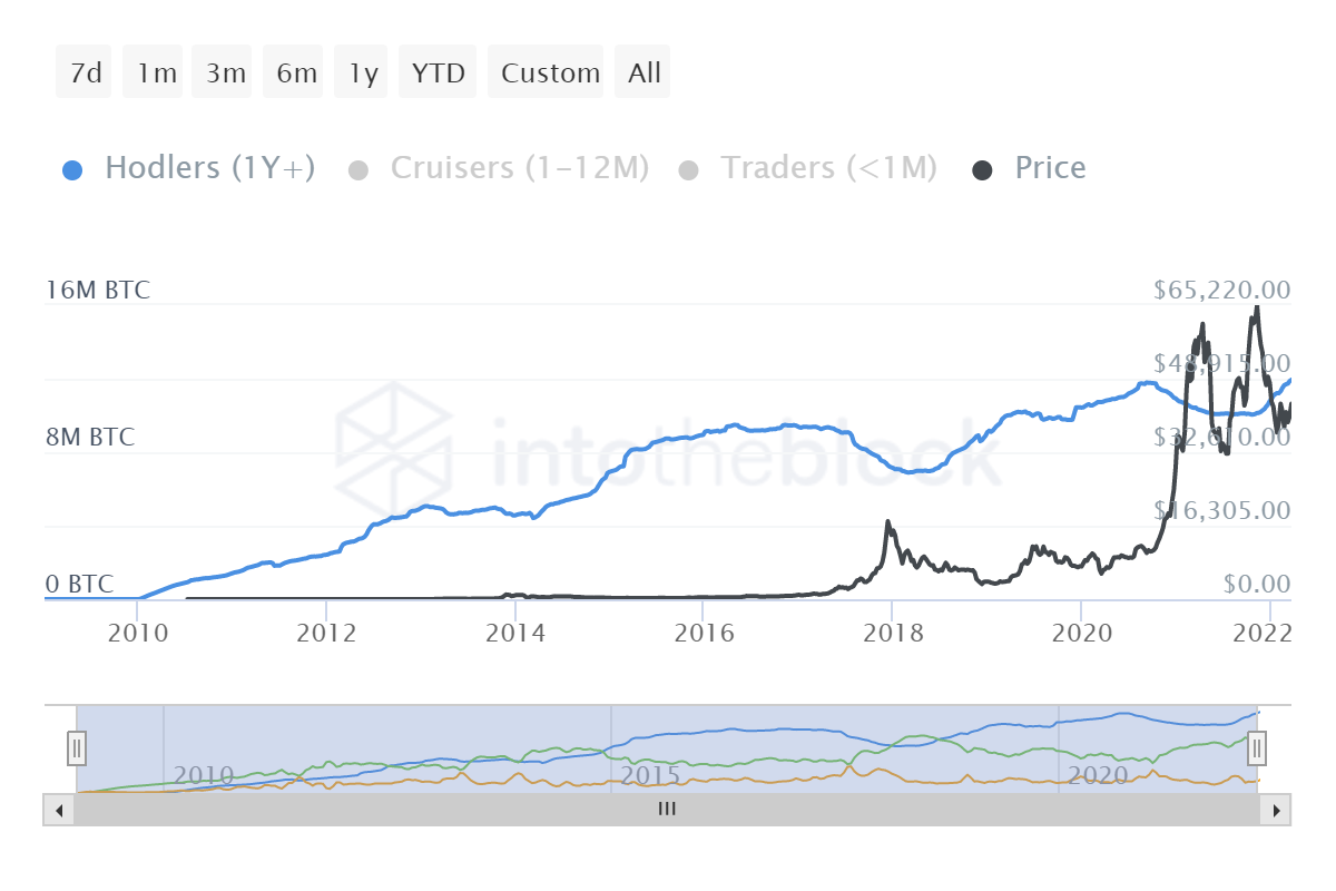
The blue line shows numebr of bitcoins that haven’t moved in over a year, data via IntoTheBlock
Furthermore, looking below at the percentage of Bitcoins over total supply that have not moved in a year, the results are similar – just in case you thought the above was deceptive. It suggests an accumulation by long term hodlers and declining selling pressure. Or, in one word, bullish.
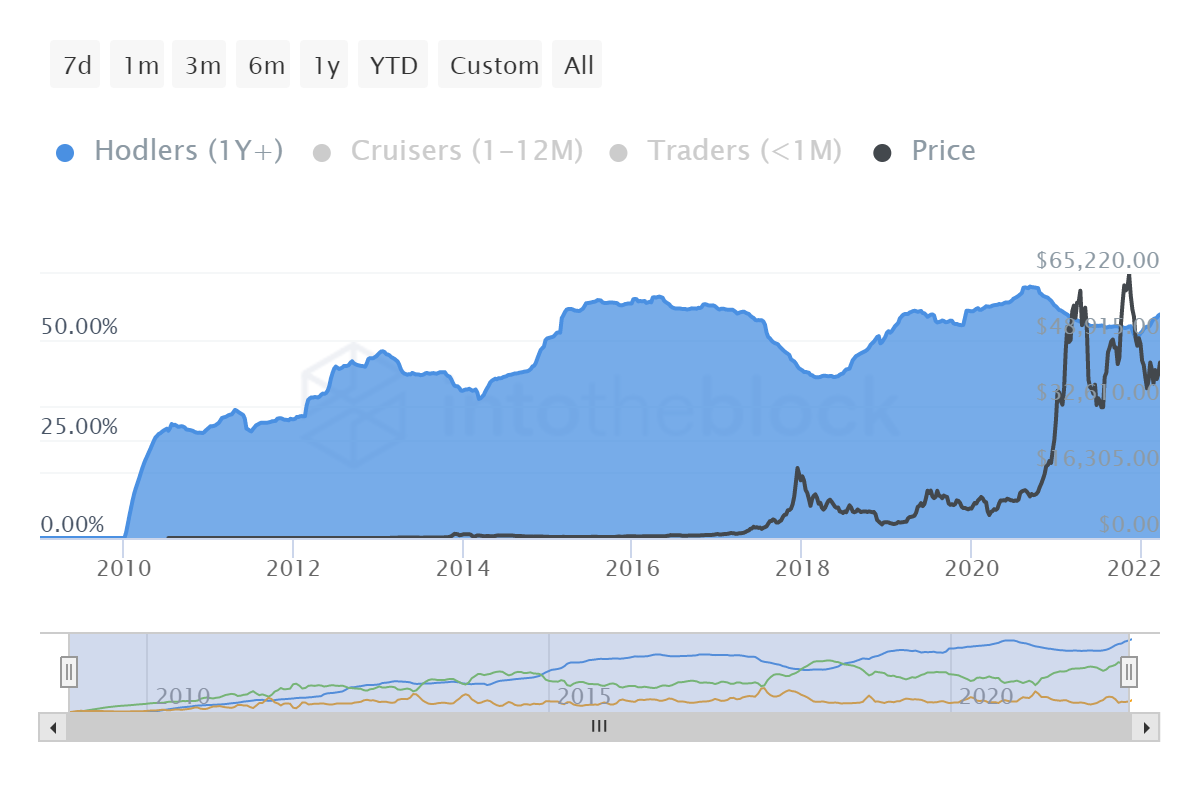
Data via IntoTheBlock
On-chain hasn’t looked this optimistic in a while. I came across the below – from @OnChainCollege on Twitter (worth a follow if you’re looking to brush up your analysis) – which corroborates my thoughts. Graphed back to early 2018, the orange circles show periods where large wallets have been selling (or not accumulating) while the grey circles show where large entities have been accumulating. The key then is purple circles, which show the transition from periods of selling to accumulation, traditionally indicators that an upward trend is about to commence.
As the graph shows, and as we discussed earlier, we are in this purple phase – a period of accumulation. And look what happened in September 2020…
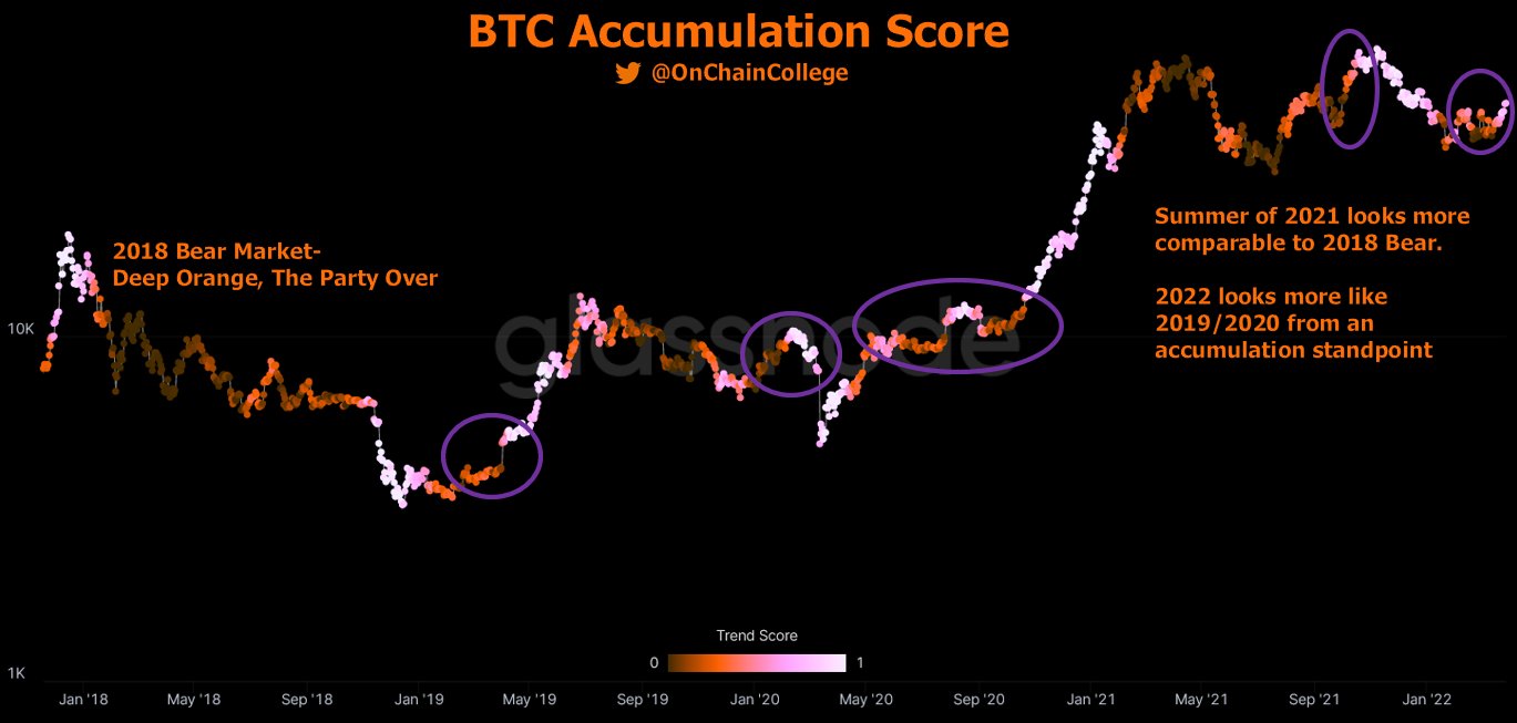 Chart via @OnChainCollege on Twitter
Technicals
I certainly don’t anchor my analysis to technicals alone, and I generally err heavily on the on-chain and fundamental side. But I do like to assess charts every now and then, especially when I feel like we are about to get movement one way or another. In this vein, I’ve come across some interesting findings this week.
First, the vortex indicator is a relatively new technical analysis tool, developed in 2010 in this excellent paper by mathematicians Etienne Botes and Douglas Siepman (seriously, if you’re a math nerd like me and you like markets, it’s a great read). I won’t get too dense here (follow that link if you want to learn more) but to quickly summarise in layman’s terms, the vortex indicator spots trend reversals via a pair of oscillating lines (like every TA tool ever, you say, but leave me alone – I don’t want a 5,000 word count here and I gave you a link to learn more).
This week on Twitter, Bitcoin analyst TechDev (@TechDev_52) posted the below chart showing the 3-week vortex indicator, which displays a bullish crossover. This has happened only four times previously (yellow triangles in chart) and, well, I’ll let the chart below the talking.
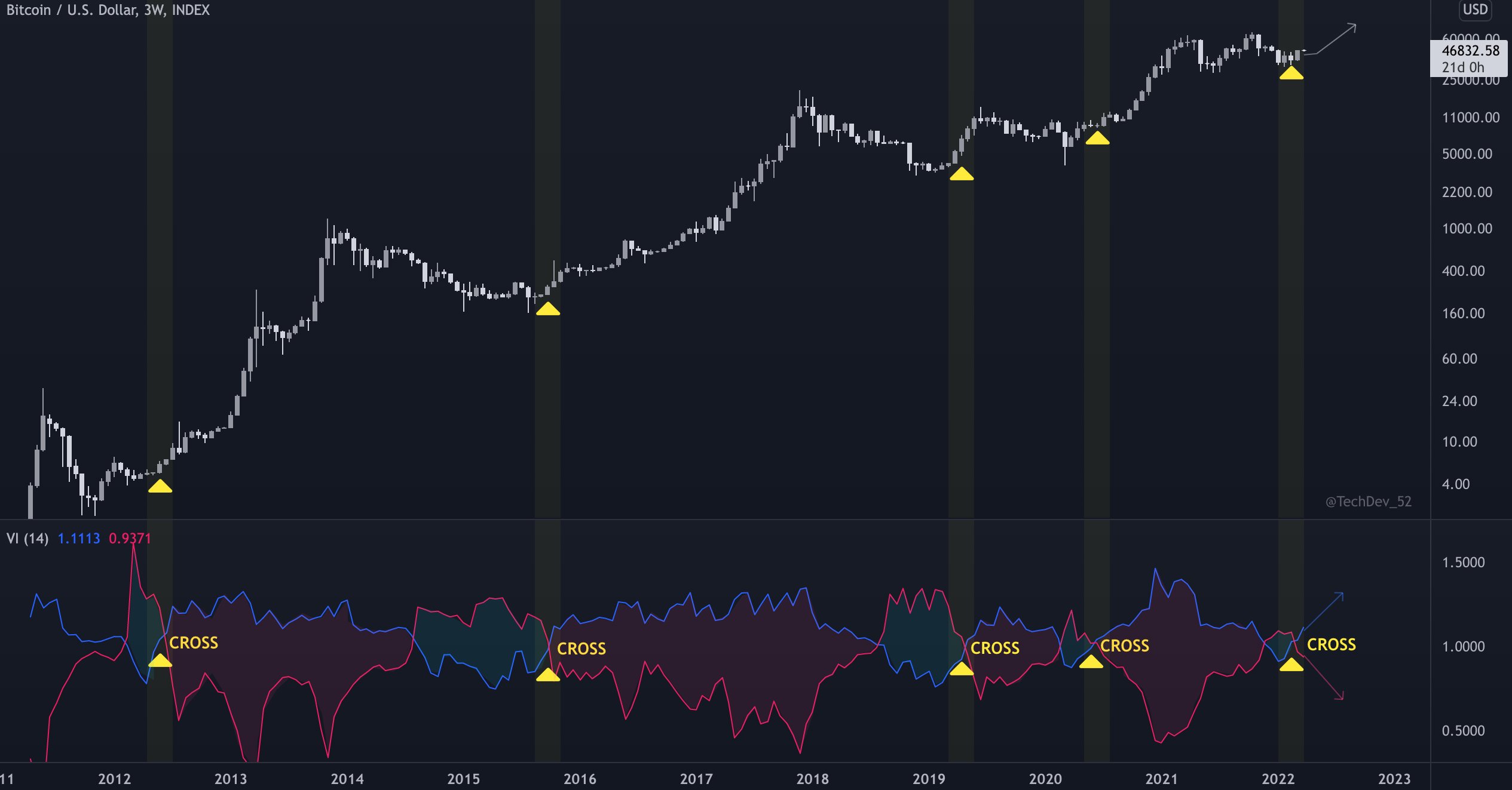
As a caveat, the vortex indicator is new, and no technical analysis should focus on one method anyway. But it’s an interesting quirk – especially when looking at other tools.
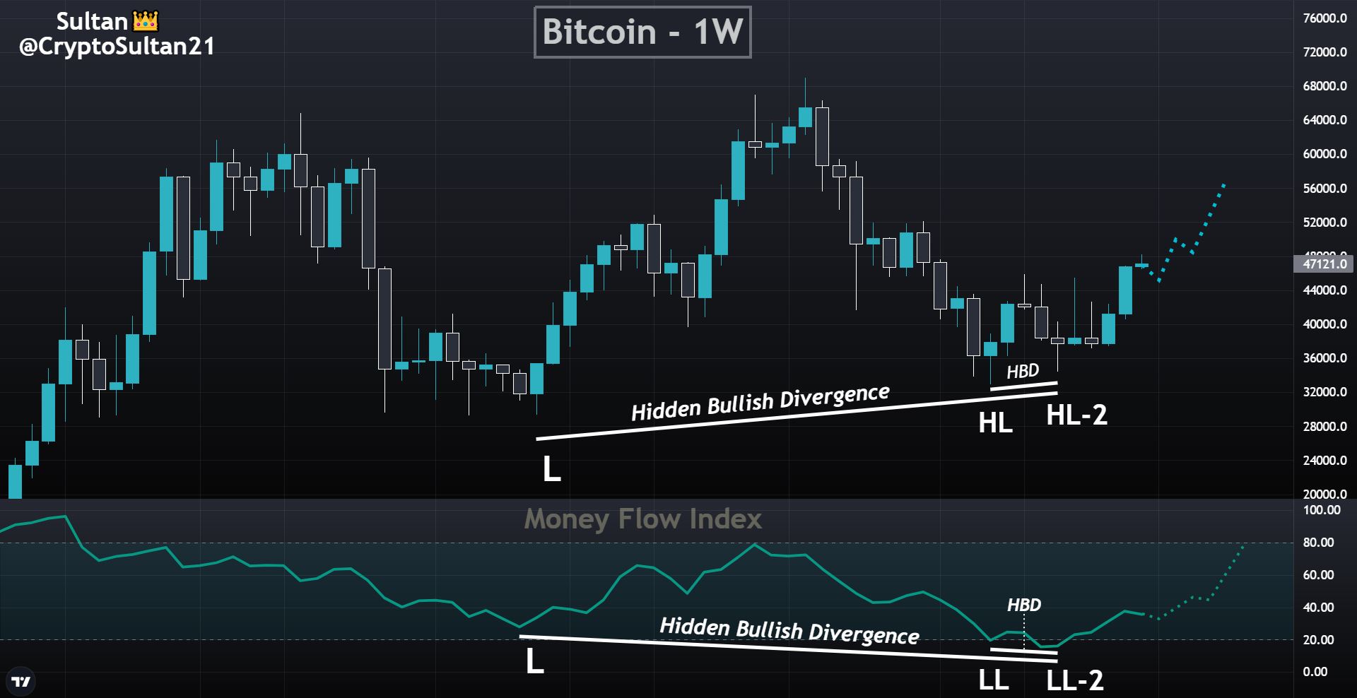
The second piece of TA I want to assess is via Sultan (@CryptoSultan21 on Twitter), looking at the weekly Bitcoin chart. Prices generated a second higher low before the recent uptick with the divergence bullish. Assessing this pattern in conjunction to the money flow index (which is an oscillator that hinges on price and volume to trigger signals) on the same chart below, which itself signals a divergence, also suggests a bullish environment.
 Conclusion
Much like the deafening thunder outside (that I can somehow hear over the music in my earphones), we are seeing a perfect storm for Bitcoin. The macro environment is absurdly conducive to a rip upwards for crypto (as it has been, in truth, for the bulk of the pandemic). On-chain data is glaringly positive. And just for the sweetener on top, we have some neat little chart patterns forming – and bullish ones, at that.
Stir it all together and I’m thinking this run upwards is not over. Of course, everything can be thrown out the window in one second if Putin decides he wants to wreck more havoc, and there could be numerous other macro events that could render all this entirely moot. But that’s the markets, and that’s the world we live in.
Moreover, most of this analysis is over a longer time frame, where I prefer to reside. Even if we wobble in the interim, I think it’s only inevitable that the important psychological area of $50,000 is breached before long.
(And seriously, this thunder is so loud it’s turning even relaxing classical music into AC/DC songs).
The post Why Bitcoin is ready to make a break for $50K appeared first on The Home of Altcoins: All About Crypto, Bitcoin & Altcoins | Cointext.com.
Go to Source
Author: Dan Ashmore


